Agent Branded Material
Century 21 Connect Realty
Description:
In the world of real estate, standing out amongst the crowd is one of the most difficult aspects of the job. These branded materials were created to accurately portray an agent’s personality and what they stand for so it gives potential clients an idea as to who you are.
Objective:
To create branded materials that helps a real estate agent stand out against the Century 21 brand, and instead use the name brand as a catalyst for your own personal business. Agents have the opportunity to have cohesive branded materials that resonate with them and also generate new business.
Specifications:
These various materials were built using the Adobe Suite and Canva.
These materials were mocked-up using the Adobe Suite and Figma.
Brand Kits
A kit created by me that consists of digital and print materials that is specifically branded per each agent.
What’s included: Social media banners, email signature, business card, and optionally, a logo.
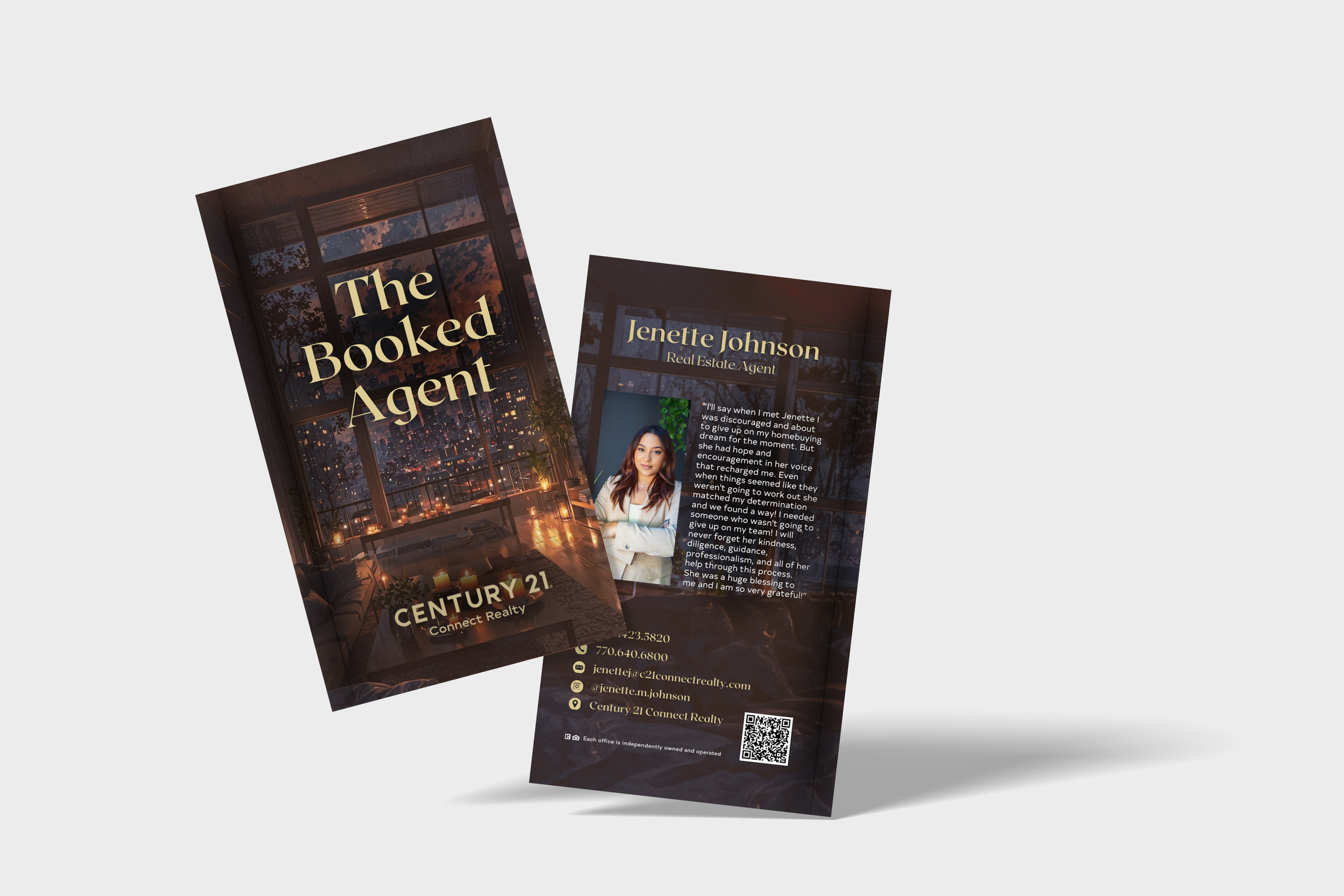
“The Booked Agent”
Description:
Jenette Johnson is a C21 agent who’s brand aligns with that of a fiction book. Her love for fantasy reads and real estate go hand-in-hand, so making this brand kit versatile to fit her “BookTok” video content was ideal.
Objective:
To create branded materials that helps a real estate agent stand out against the Century 21 brand, and instead use the name brand as a catalyst for your own personal business. Agents have the opportunity to have cohesive branded materials that resonate with them and also generate new business
Description:
Denzail “Wulf” Jones, is a C21 agent who’s business mixes real estate, coaching, and basketball. He recently acquired a blue suit and that combined with his pre-exisiting wolf head, became the direction that he wanted to pursue.
Objective:
To use Denzail’s combination of business ventures, his abbreviated tagline, and prior branding to create an elevated identity that’s cohesive across medias and also appeals to all aspects of his ventures.
“Warrior Understanding Life’s
Fulfillment”
Description:
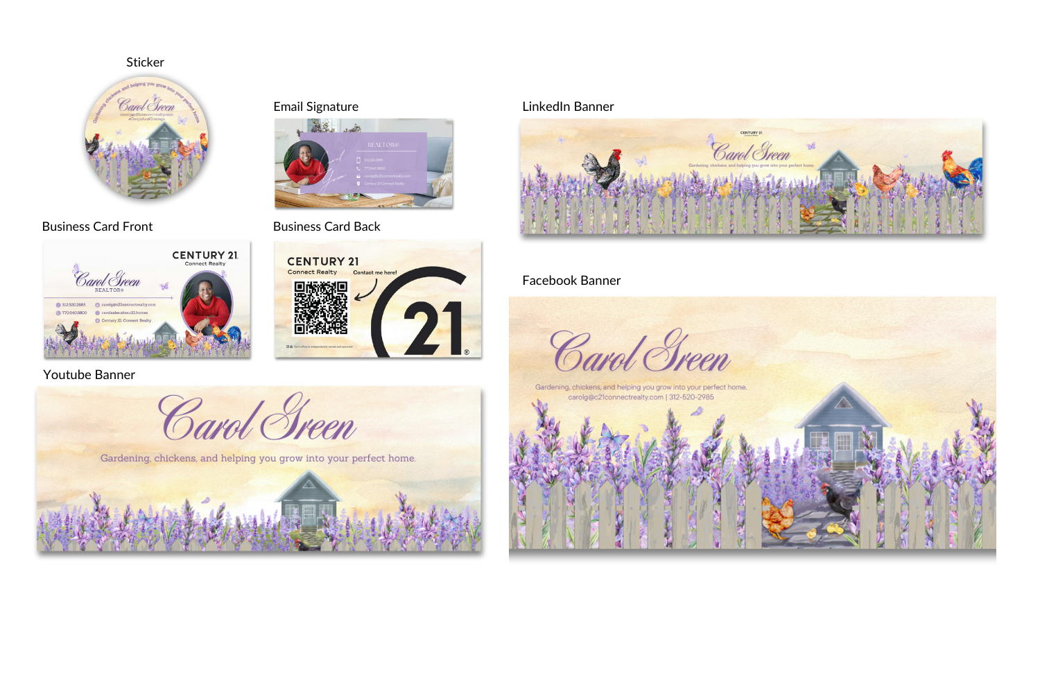
Carol Green is a C21 agent who enjoys farming and gardening, which she wanted to translate into her branding. While focusing on older generations, she wanted her brand to feel homey and incorporate the things you can find at her home: Fields of lavender and her chickens.
Objective:
The goal for Carol’s brand was to create something that resonated with her personally and incorporated her tagline “Coops to Closings.” Her favorite color is a lavender purple and it was important for her chickens to be shown within the imagery, so incorporating all of these various aspects throughout her materials was necessary.
“Coops And Closings”
Other Branded Materials
Branded materials requested by agents; These show my use of Canva to quickly turn out designs and complete multiple requests per day.
Turnaround times varied depending upon the project: Business cards would be no more than 24 hours, newsletters would be no longer than 48 hours.
“Destination ATL”
Description:
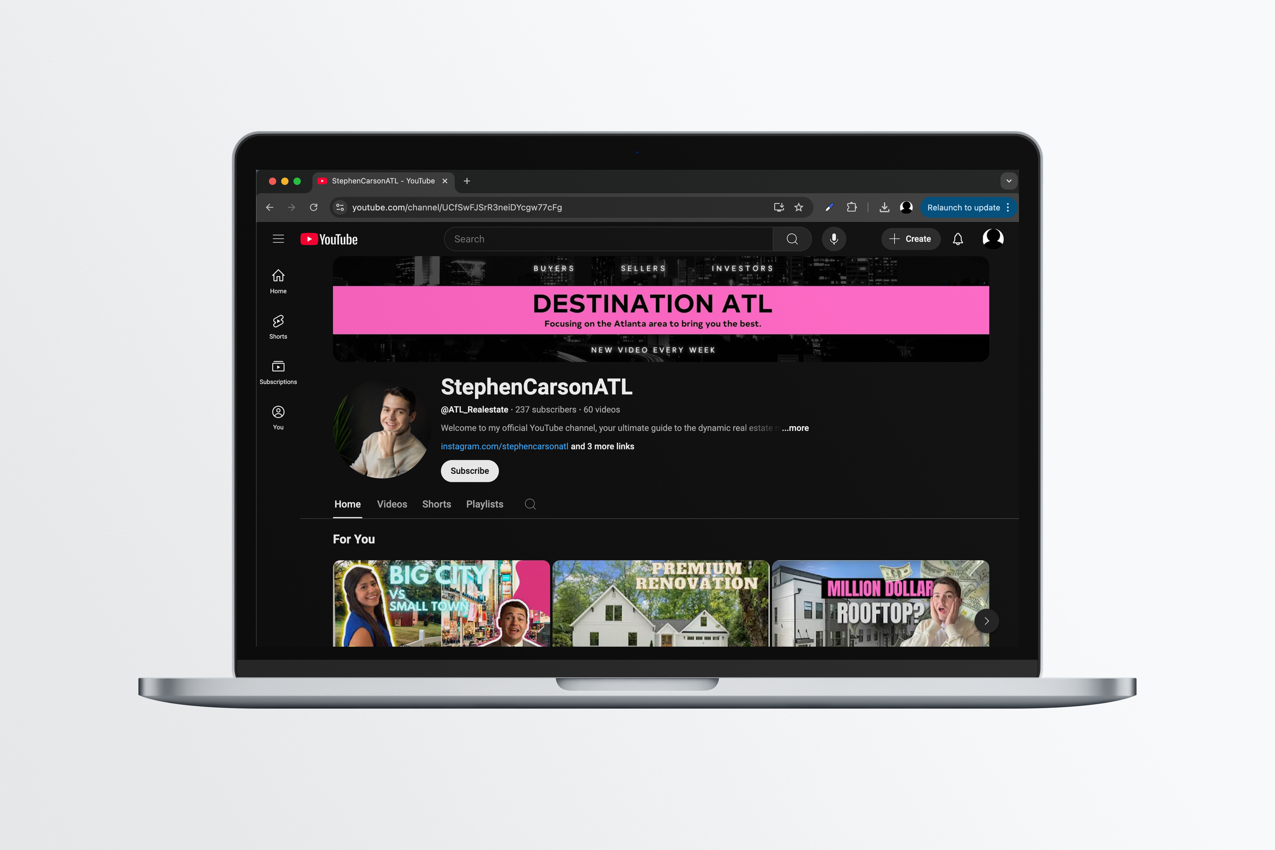
C21 agent Stephen Carson, had branded himself as ‘Destination ATL’ where his target audience age ranges to mid 20 - young 30 year olds who work in tech, finance jobs with a mid to high salary range. Stephen’s brand colors are black, pink, and a light gray.
Objective:
Stephen’s focus is his Youtube Channel where he posts insights into the Atlanta housing market, while giving helpful advice to those curious about the area. The goal was to create a banner for his channel that would encompass his pre-existing brand while elevating it to fit his current target audience.
Horseshoe Bend Advertisement
Description:
C21 agents Kim Thompson and Liz Dilworth focus their business on the Horseshoe bend community located in the Roswell area. They regularly take part in various communal events and are active in the HOA. This was a requested advertisement for this years Horseshoe Bend directory which they have an ad in every year.
Objective:
The design goal for this advertisement was to create something inspired by the picture they had the taken for the directory which shows them in different orientations. The advertisement utilizes Century 21 colors and type to clearly depict the brand they work under.
Meredith Von Kleydorff
Description:
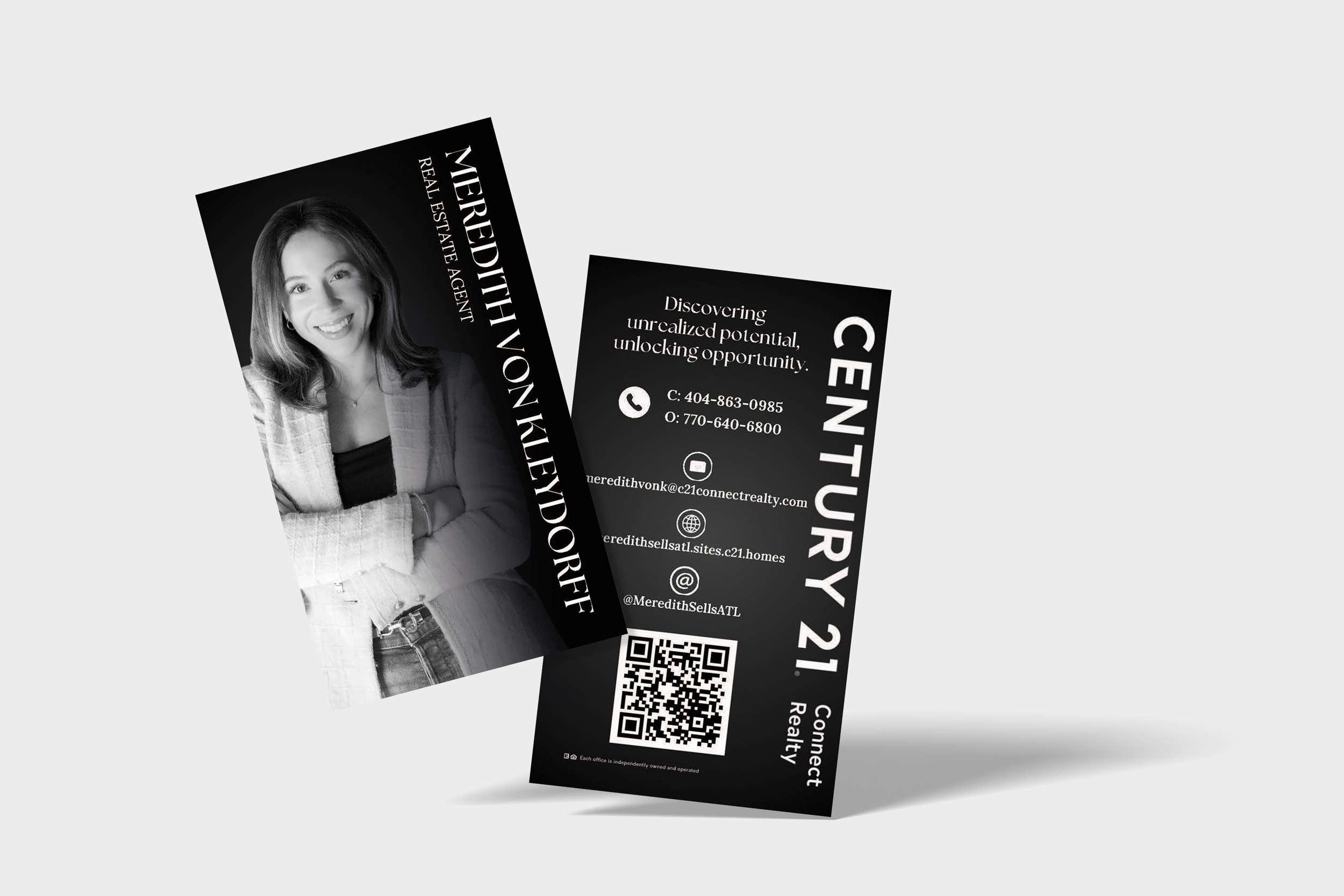
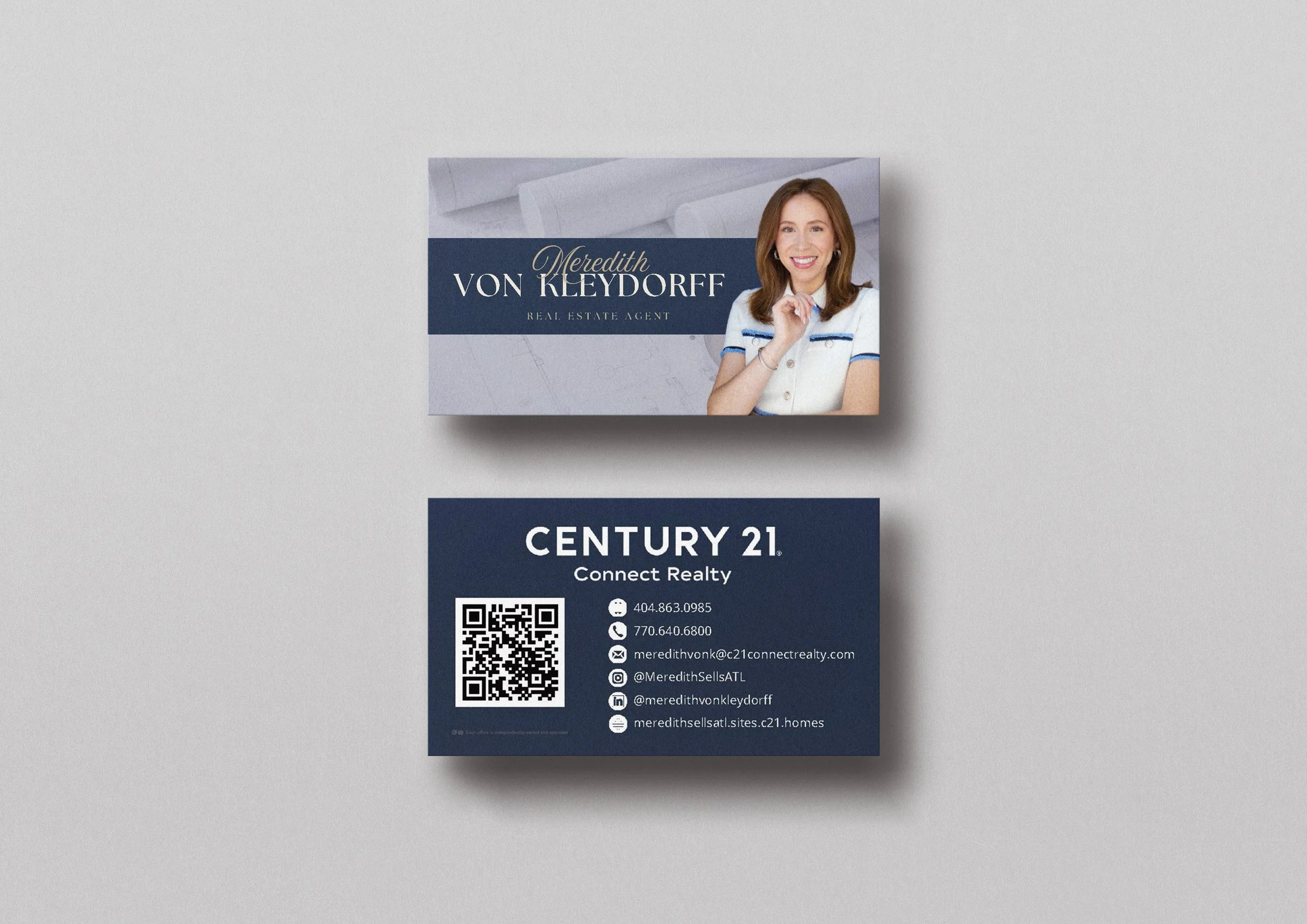
C21 agent Meredith Von Kleydorff target clientele is investors and young professionals looking in the outer Atlanta area. Meredith had requested these 2 business cards and had already had designs picked out that she wanted implemented into her own branding. For her investor business she focuses on a black and white palette, while the residential side of her business focuseses on a white and navy blue color scheme.
Objective:
The goal for these sets of business cards was to create a design accurate to the ones she found, but implemented the specific assets within her brand and resonates with her target audiences.


